The Letting Game
An award-winning letting agency in Bristol that does things a bit differently. They’re not just about finding properties and signing leases, they want to feel human, approachable, trustworthy. They’ve built a reputation for clear communication, no-faff service, and good presentation.
We brought character and personality to the brand to reflect it’s customer-centric approach. Putting people before process. A monochrome brand suite which is bursting with character.


Independent character
The challenge
The Letting Game had strong word-of-mouth and awards to match, but their brand presence didn’t fully reflect the professionalism and character of their service. They needed to speak to two audiences at once – busy landlords and renters – in a way that felt modern, transparent and distinctly Bristol..
The approach
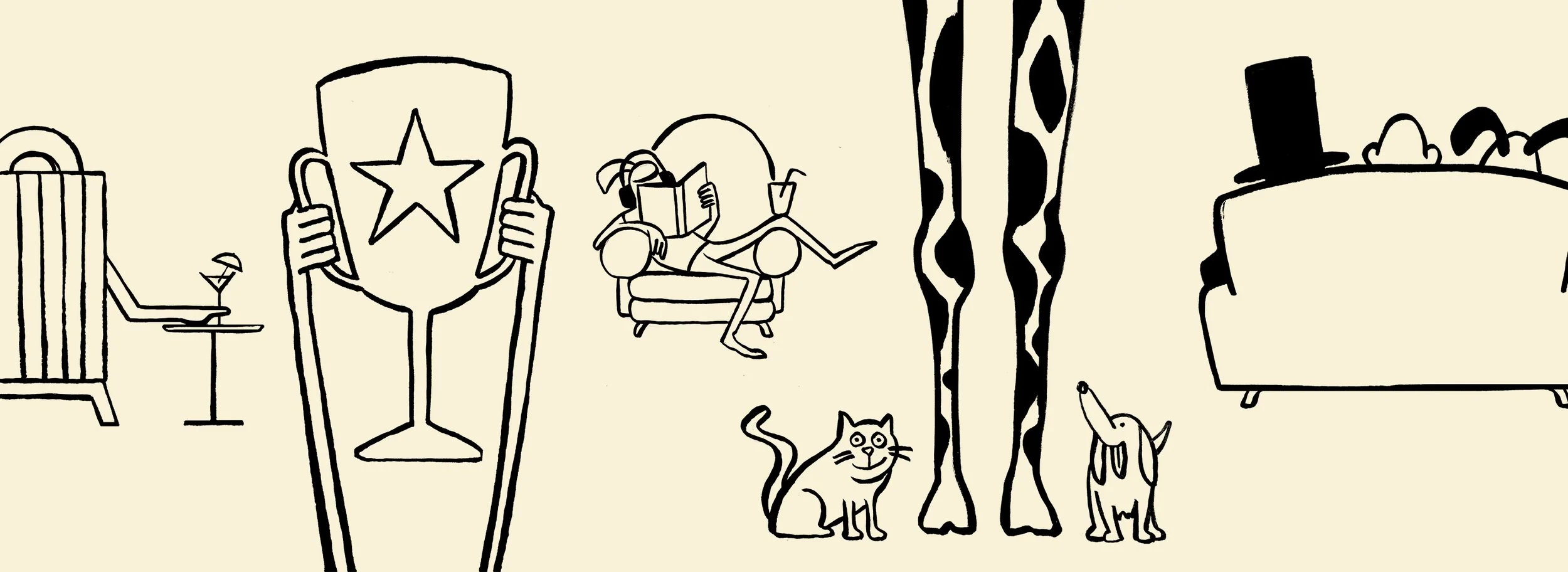
We brought colour and character through illustration and hand lettering. Stripping back the primary palette to achieve cut through in a busy marketplace. We worked closely with the super talented illustrator Tom Morris and Lettering Artist Emma Luczyn to bring a level of personality that goes deeper than photographs of agents shaking hands with landlords.
The outcome
The updated brand reflects the characterful city that it works in, adds a deeper connection to the people it serves and stands out brilliantly wherever it shows up - whether its on a stand at a trade show or a sign on your street.
Looking to make your brand more personal?
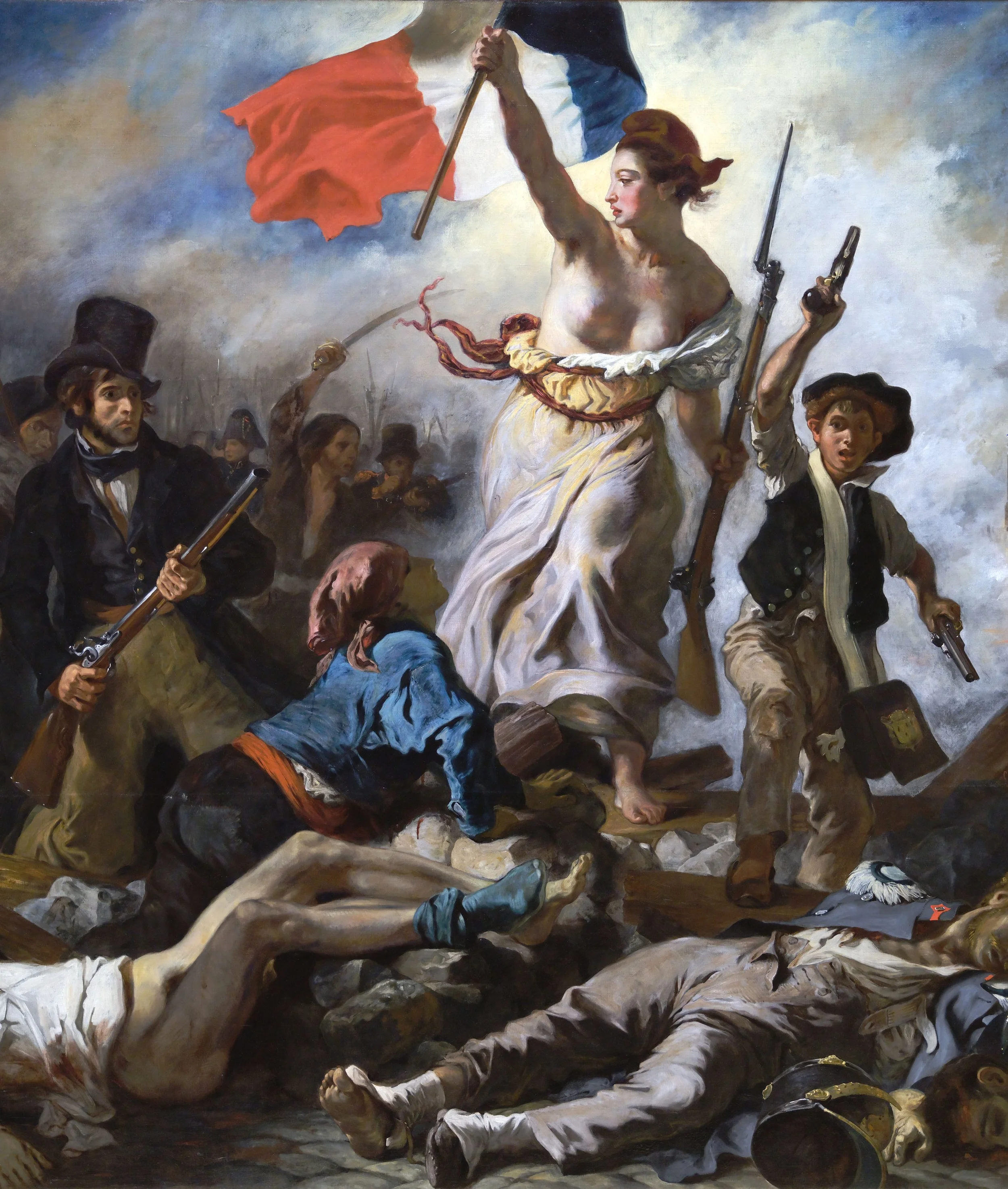
The intentional key / flag reference to independence (business) a subtle nod to La Liberté by Eugène Delacroix. In a world full of corporate agents, we said ‘take back control’.
What we did
-
Brand positioning is about deciding where a business sits in the minds of its audience.
For The Letting Game, that meant rethinking how the city’s character was expressed. The previous identity leaned on literal references. Colourful rows of Bristol houses. Familiar, but obvious.
The opportunity was to capture the spirit of the city without illustrating it. To tread the line between professional and characterful. Confident enough to stand apart from the corporate crowd, but never garish or shouty for the sake of attention.
The result is a more considered, customer-centric expression of a business that was already being recognised for the way it treats people. An intentional shift that better reflects how The Letting Game actually shows up for its clients, every day.
-
Identity design is about giving a brand its own visual language, the colours, type, and marks that make it instantly recognisable.
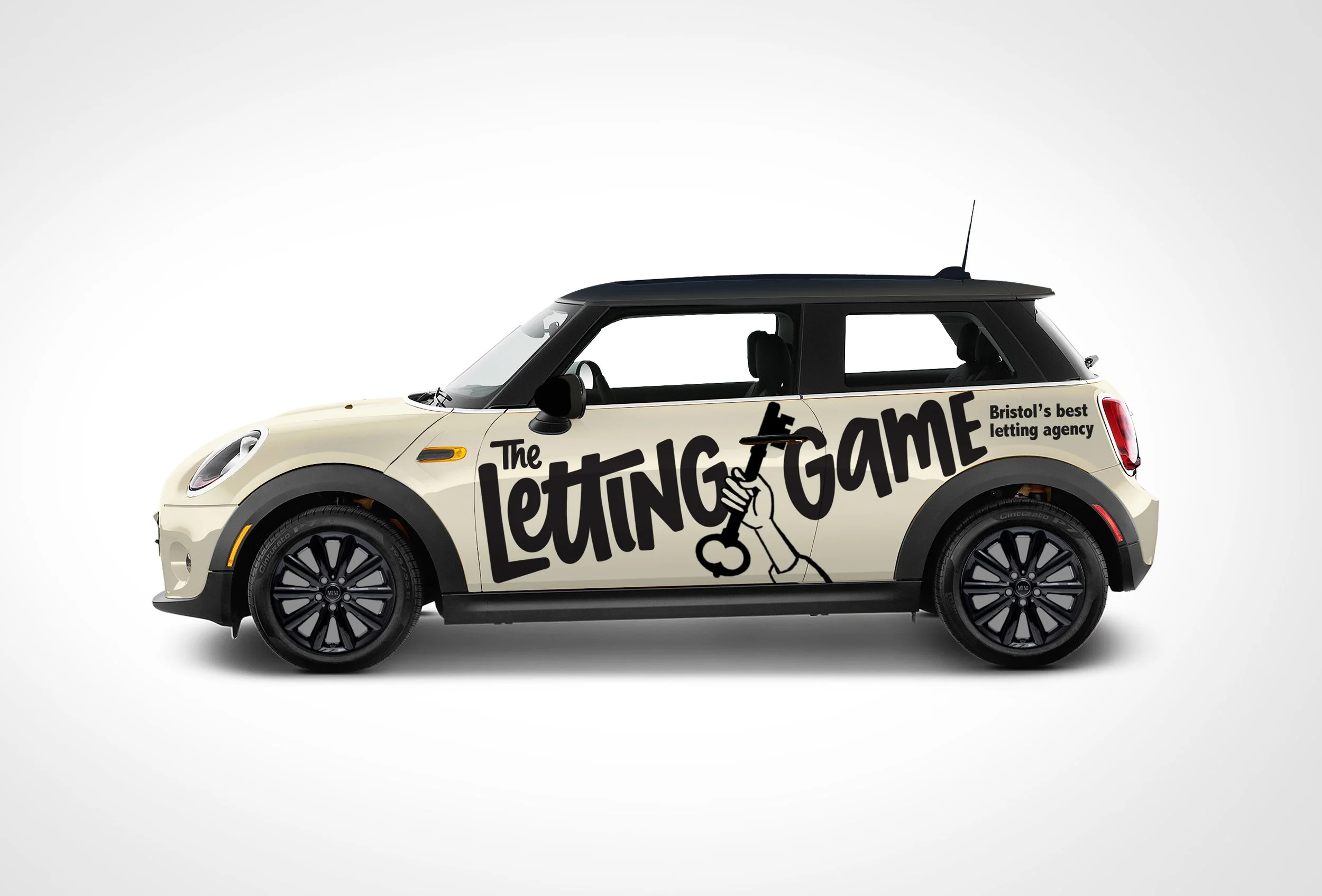
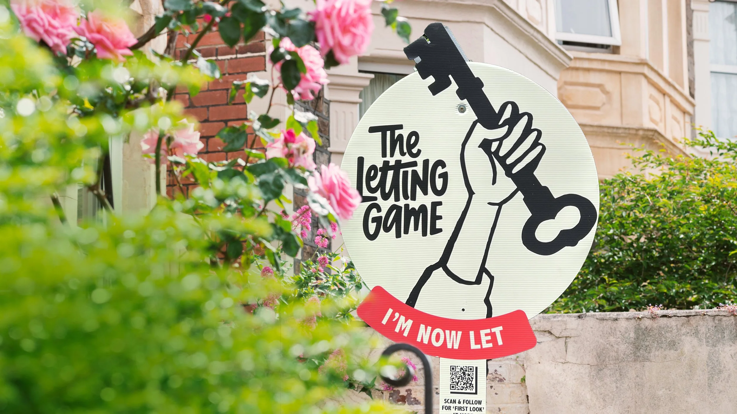
For The Letting Game, we introduced a hand-rendered logotype and a set of personal glyphs, paired with characterful, humorous illustration. Together, they brought much-needed personality to the brand without undermining its credibility.
The colour palette was deliberately stripped back, allowing the identity to cut through a saturated marketplace with confidence rather than noise. The result is a system that sits comfortably between tenants and landlords. Approachable, human and professional in equal measure.
Crucially, the identity needed to be both recognisable and flexible. Confident enough to hold its own on 12-metre billboards along the M32, yet considered enough to work just as well on business cards and across a fleet of Minis.
-
Copywriting is about giving a brand a voice that no matter where it exists, people recognise and remember.
For The Letting Game, humour was a tool. Puns in plenty, because when something makes you smile, it sticks. A gentle nod to the independent spirit of the brand and the personality behind it, without tipping into novelty for novelty’s sake.
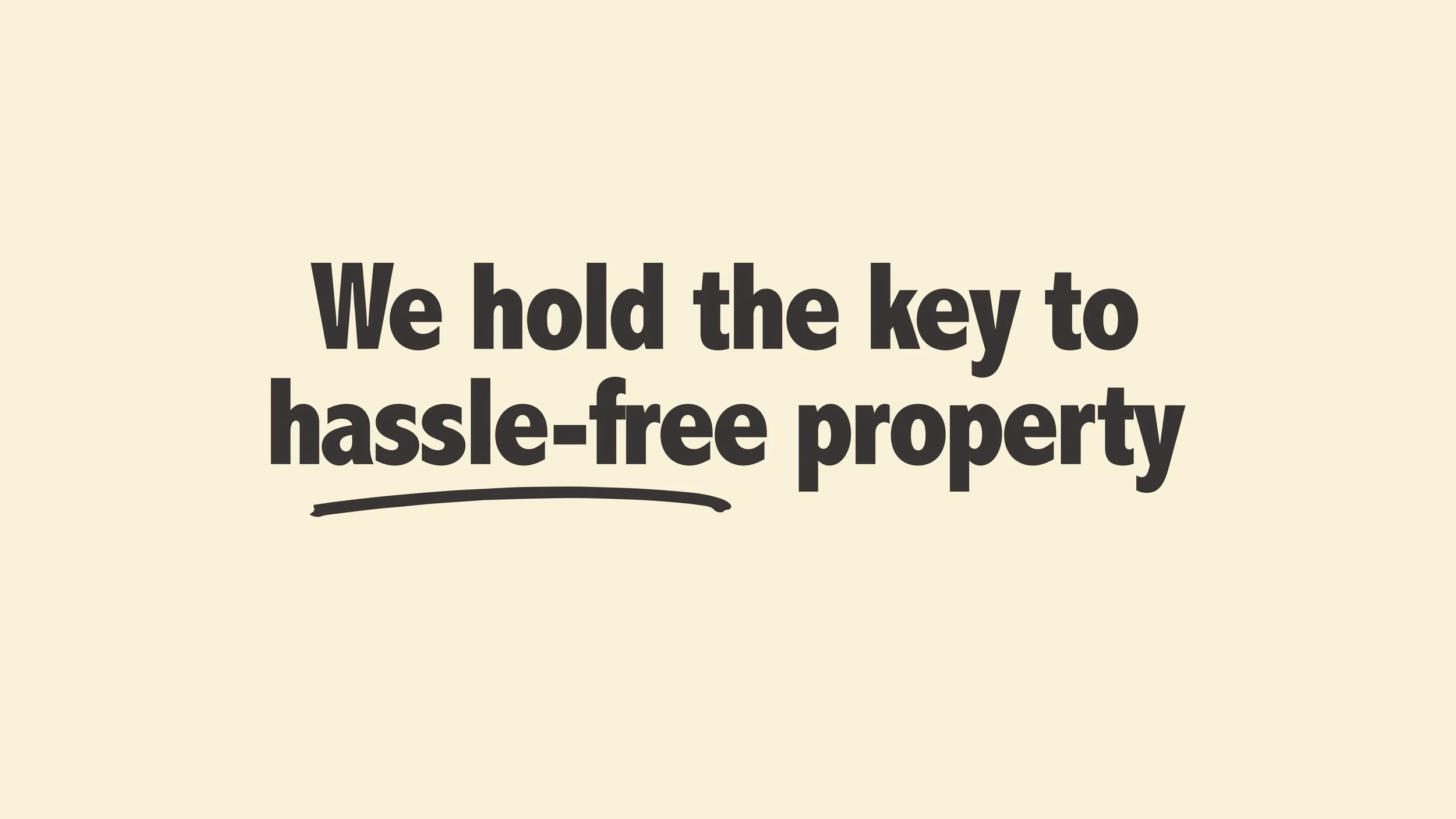
Language leaned on rhythm and play. Onomatopoeia. Alliteration. Wordplay that reinforced the idea that The Letting Game holds the key to hassle-free property, while keeping things light and approachable.
The rule was simple. If it doesn’t sound like something you’d say to a friend, it doesn’t make the cut. The result is copy with warmth, confidence and character. Type with personality. Words that feel lived-in, not laboured.
-
Marketing materials are where the brand comes to life.
Bringing all the elements together across advertising, digital, out-of-home, paid and earned media.For The Letting Game, the flexibility of the brand allowed us to dial the humour up or down depending on context. Playful where it could be. Polite where it needed to behave itself. Direct mail campaigns paired targeted headlines with promotional offers and incentives, using wit to earn attention rather than shouting for it.
The real joy of a system built on illustration and humour is how far you can push it. From trade-show games where willing punters unlocked a bank of lockers to reveal prizes, through to giant roadside billboards with oversized keys bursting beyond the frame.
It’s a brand designed to travel. One that feels at home across every marketing touchpoint, without losing its character or its credibility.
Bradley Rennie, Marketing Director The Letting Game
“Tom was the creative genius behind our rebrand and then executed it across our digital and offline touchpoints. The branding really provides cut-through in a very busy market. We regularly receive positive comments from new clients.”