
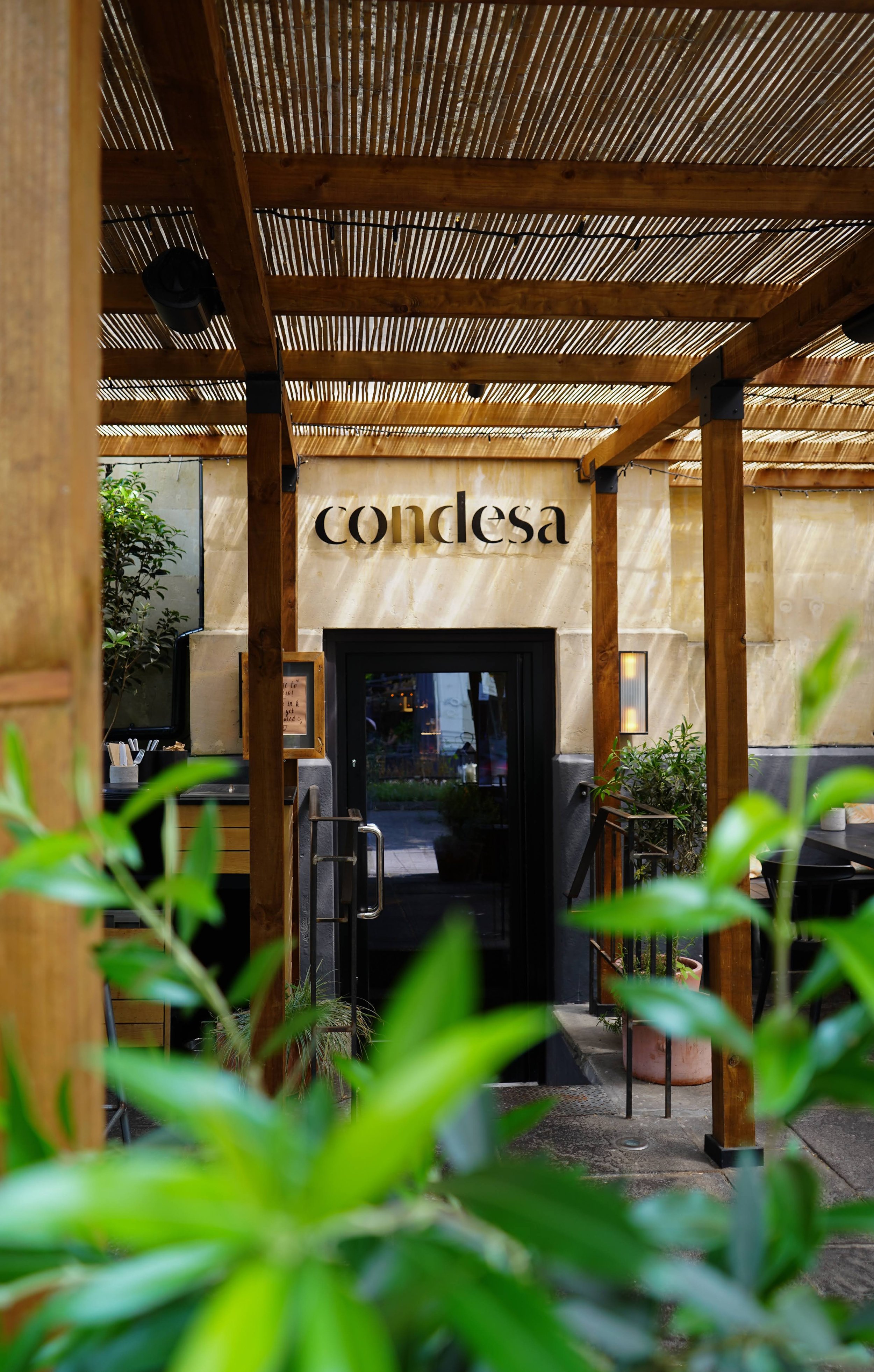
Condesa
Condesa is a Mexican-inspired restaurant bringing charcoal-cooked plates, tequila and mezcal-led drinks and a candlelit atmosphere to Bristol. All-day service, walk-ins welcomed,
and a focus on long evenings over sharing plates in a dark, tactile atmosphere.
We worked with Condesa to build a brand that matched that intimate, fire-lit energy.
The challenge
Condesa needed to introduce itself to a city already familiar with Mexican flavours, but less used to this particular mix of open-flame cooking and grown-up drinks. The brief was to avoid clichés, capture the warmth of the room and make the experience feel special without becoming stiff or formal.
The approach
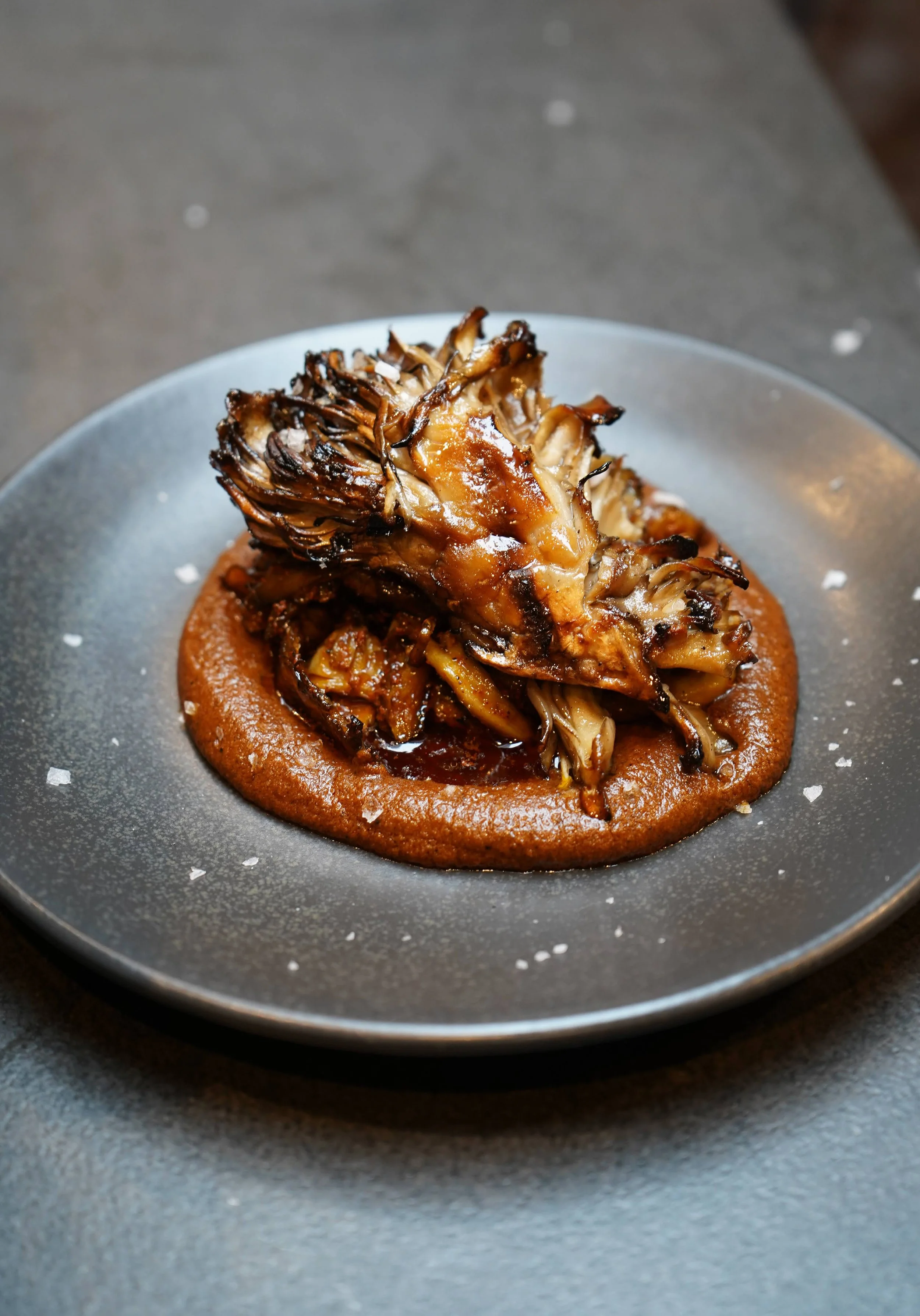
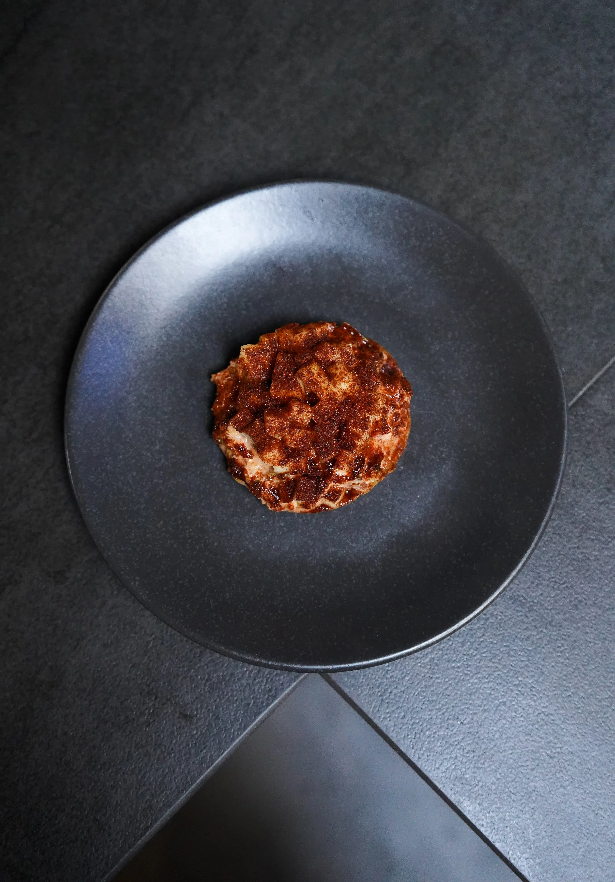
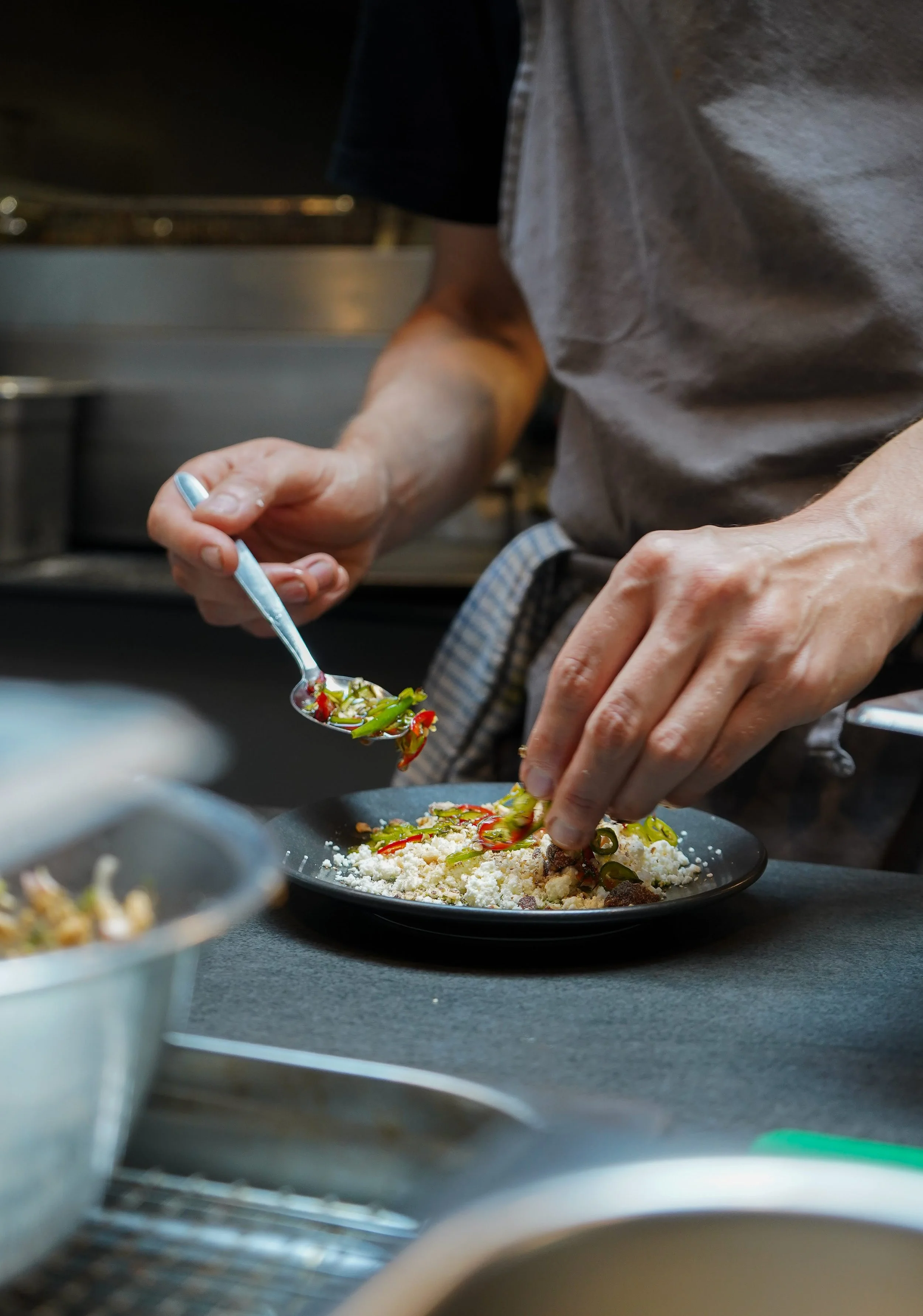
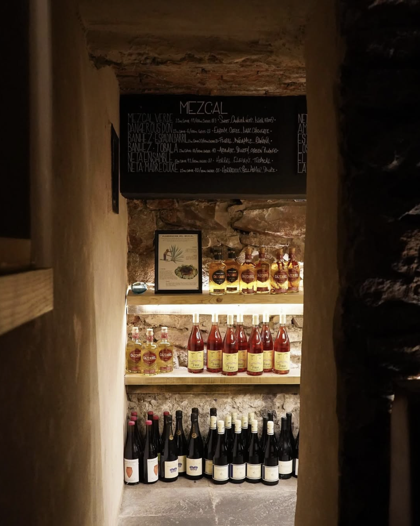
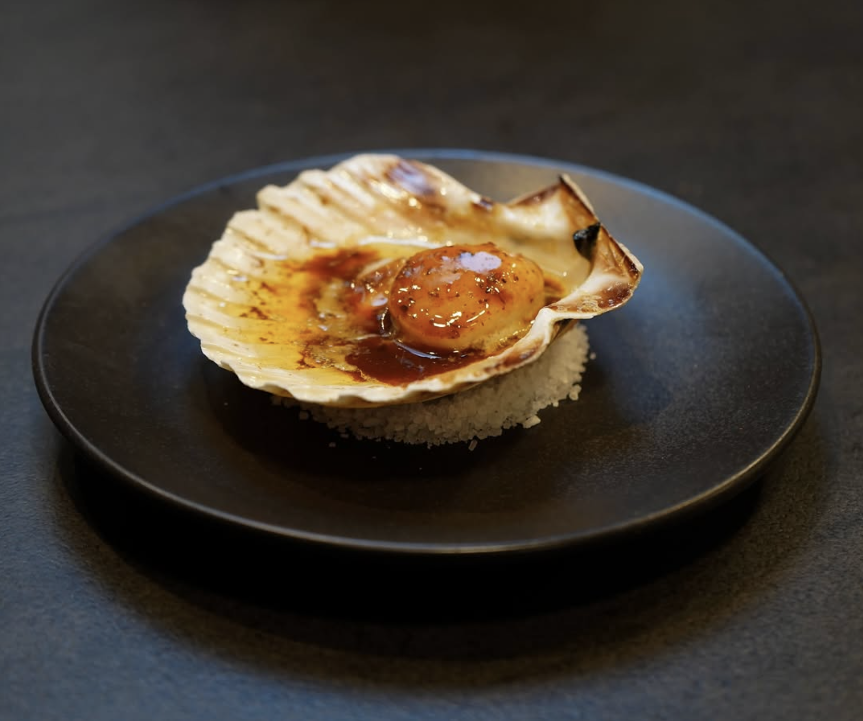
We developed an identity and icons built around the elements and contrast: light and dark, smoke and colour. A restrained palette, typography straight from the stamped hessian bags on the agave farms, and photography that brought the sharp contrasts and flavours to the table.
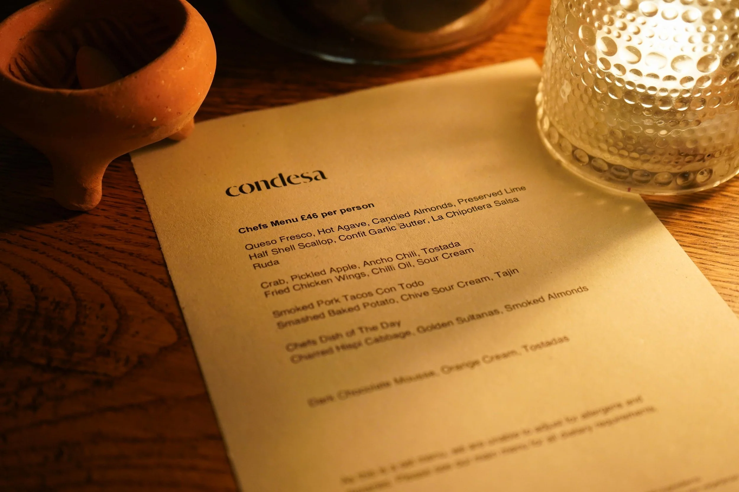
Menu layouts and print materials were designed to be tactile and unfussy, keeping attention where it matters: on the food, the earthenware tableware, the fire and the atmosphere.
The outcome
The finished brand gave Condesa a recognisable but quietly confident presence, on-site and online. Guests get a clear sense of what to expect before they arrive, and once they’re in the room everything – from the menu to the matchbox – feels like part of the same story.
Looking to bring more flavour to your brand?
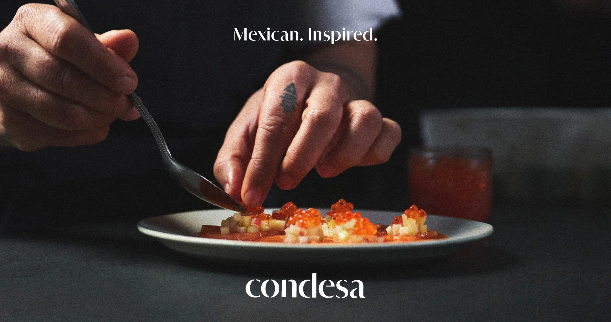
Mexican. Inspired.

What we did
-
Brand positioning is about deciding where a business sits in the minds of its audience.
For Condesa, that meant resisting the urge to shout. Instead, we focused on understated confidence. Letting bold flavours, punchy contrast and quality ingredients do the talking. The energy comes from the food, the room and the people in it, not from heavy-handed branding.
Serious food, real flavour, and a buzz that feels earned rather than manufactured. -
Identity design is about giving a brand its own visual language, the colours, type, and marks that make it instantly recognisable.
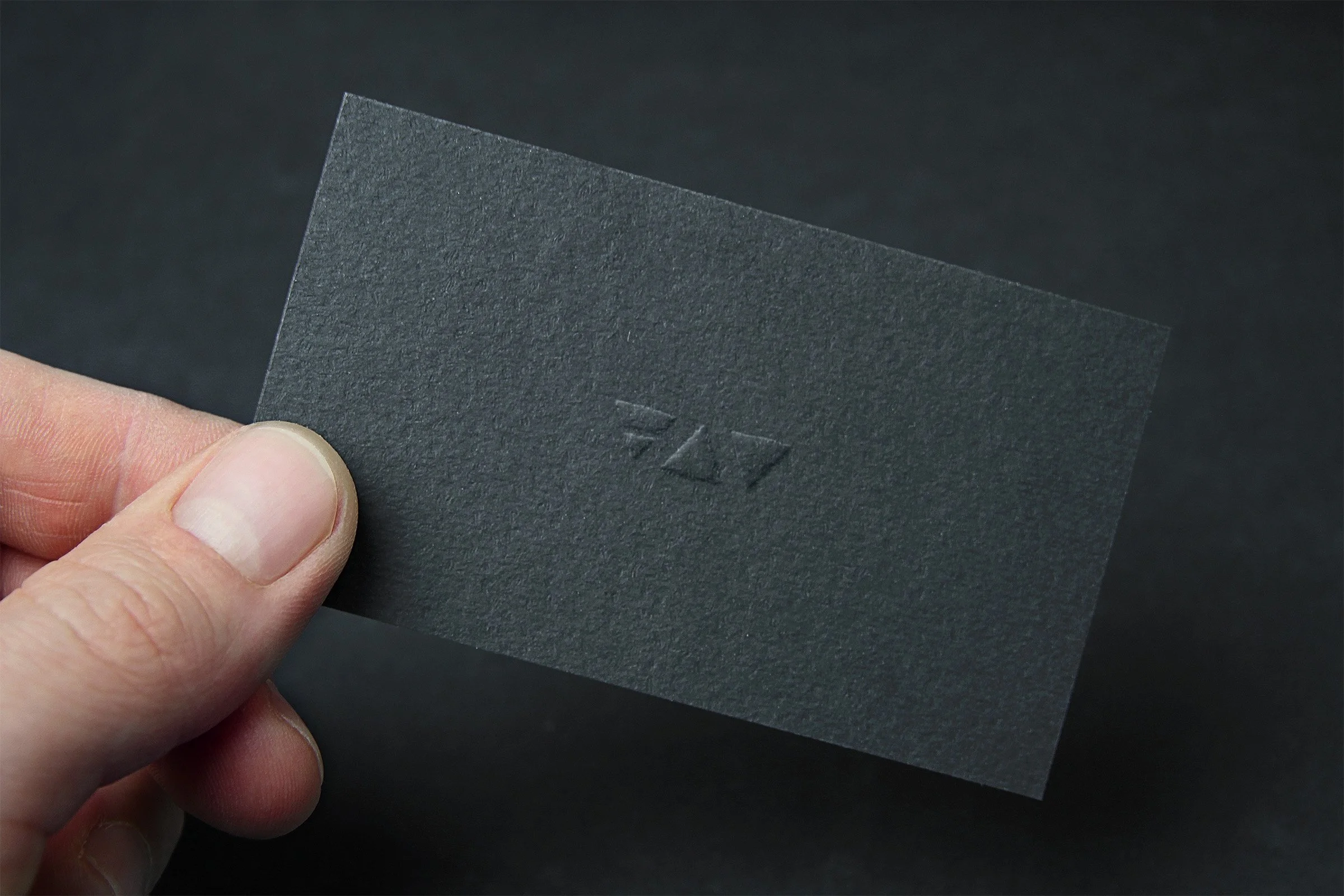
For Condesa, the logotype was inspired by the hessian sacks used to transport agave for mezcal production. Simple, tactile and distinctive, it feels rooted rather than styled.
Alongside this, we introduced three elemental icons. Earth, water and fire. The foundations of Condesa’s food and drink. Internationally recognised symbols that sit quietly in support of the main mark, adding depth and storytelling without distraction.
Nothing overworked. Nothing over-explained. Just a system that lets the character of Condesa speak for itself.
-
Art direction is about shaping how a brand shows up in the world, the stories, moods and moments that bring food and drink to life.
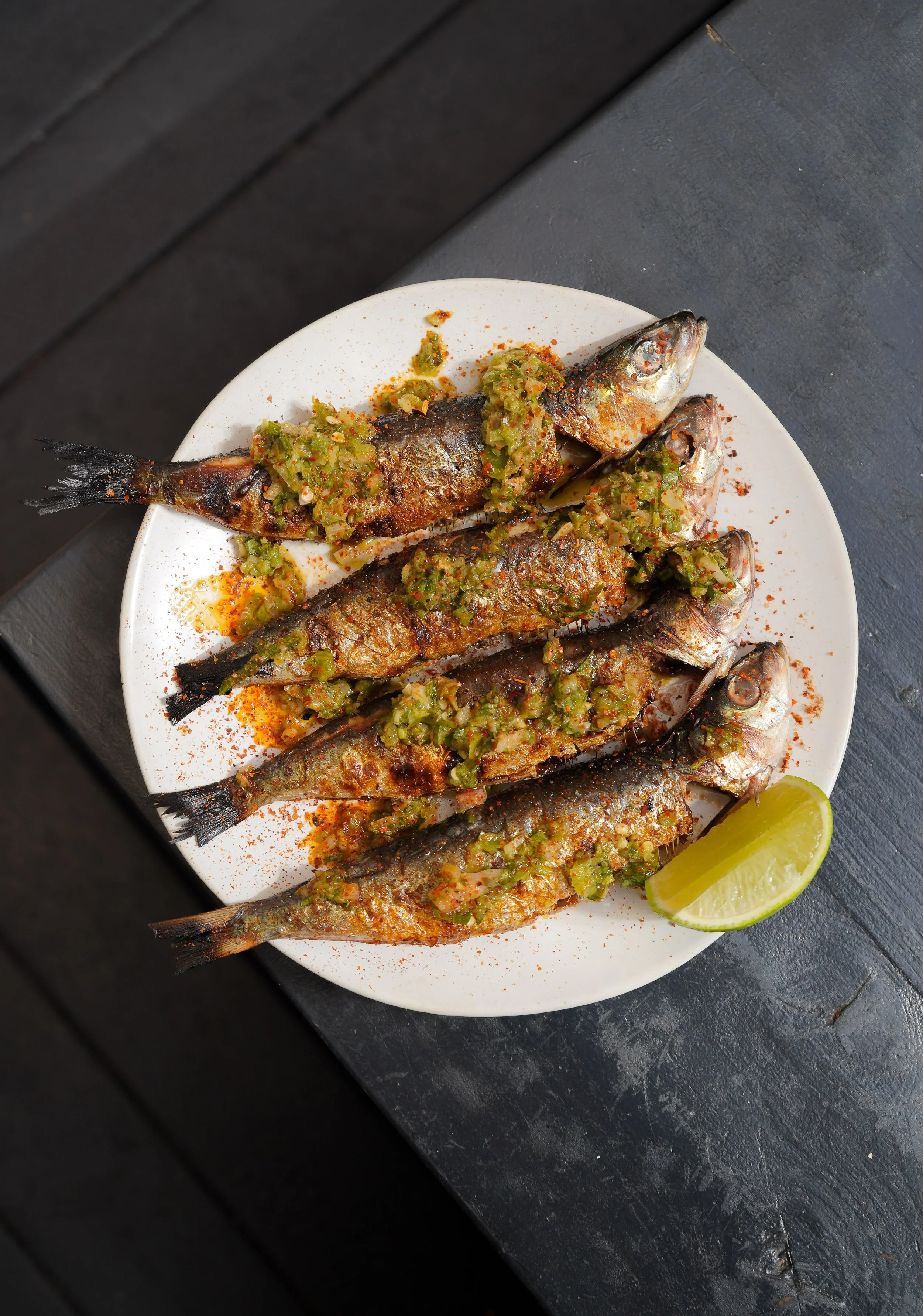
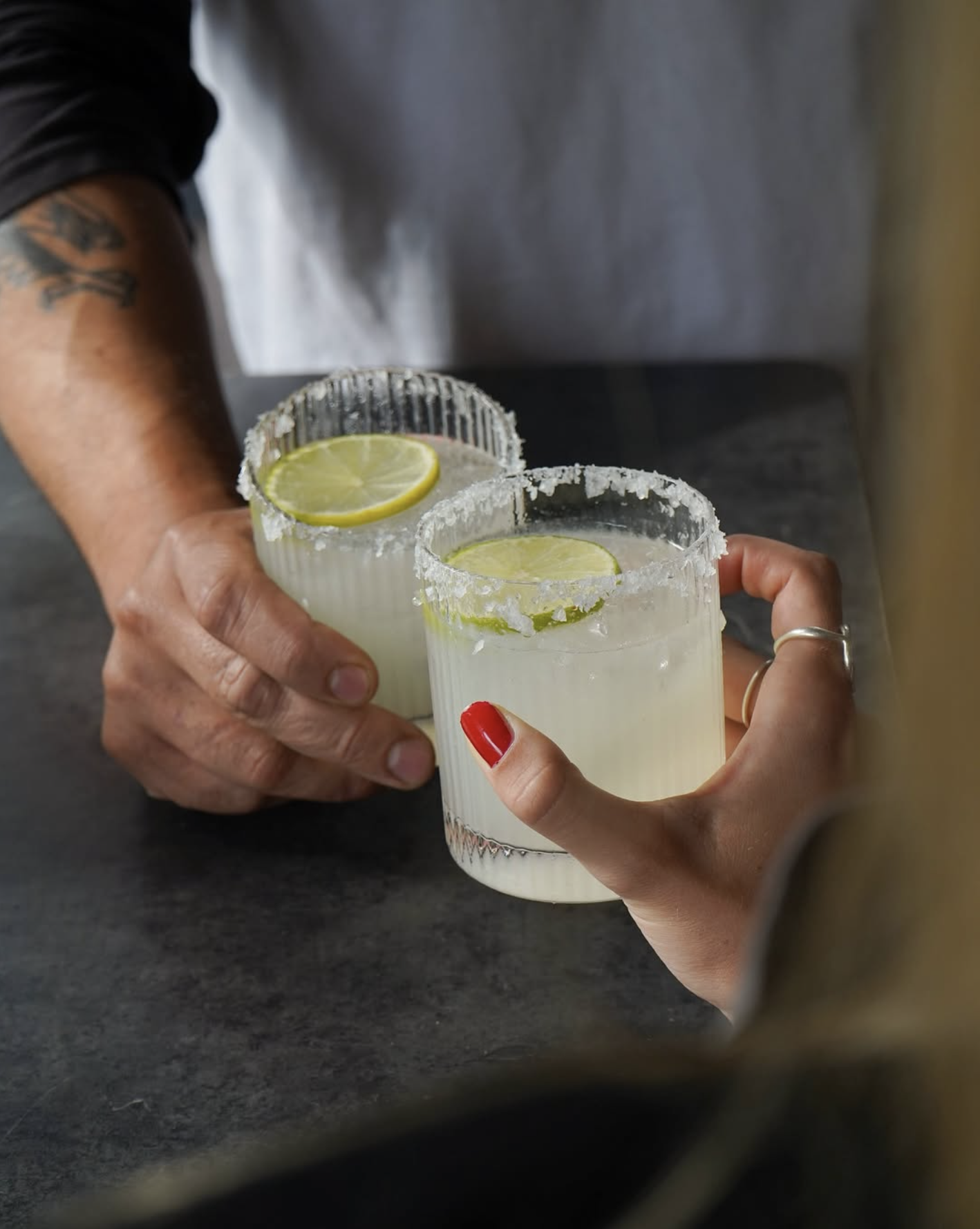
For Condesa, everything is built on contrast. Black charcoal against bright amber flame. The sharp lift of lime cutting through smoky agave mezcal. Mexican in spirit, not in stereotype.
The photography needed to hold both sides. The depth and warmth of the flavours, and the warmth of the room itself. Low light, fire glow, close moments. Cosy, intimate and convivial.
A place for celebrations and date nights. For lingering conversations. And for meeting your next great love in food.
All of the beautiful photos ©Isabella.rmjones