
The Bristol Practice
Brand strategy and identity design for a private health clinic in the heart of Bristol that sees wellbeing as a long-term journey.
Their approach moves beyond short appointments and symptom-led care, focusing on continuity, lifestyle and trusted patient relationships to support lasting change.
Our role was to translate this philosophy into a brand identity. We balanced a contemporary, forward-thinking feel with the reassurance expected by high-earning professionals, using a subtly connected monogram, refined typography and warm, lifestyle-led imagery. The result is a healthcare brand that feels personal, credible and rooted in Bristol.


The challenge
Private healthcare often feels cold and clinical. The Bristol Practice needed a brand that felt modern, human and relevant to younger professionals who expect more from their health.
The approach
We created a connected B–P monogram and paired it with lifestyle-led imagery, positioning healthcare as an ongoing journey, not a one-off transaction. Professional, but never distant.
The outcome
A brand that feels trustworthy without being intimidating. Contemporary, confident and rooted in modern lifestyles. A clear point of difference in a crowded sector.
Does your brand need a health check?
Practice means progress
What we did
-
Brand positioning is about deciding where a business sits in the minds of its audience.
For The Bristol Practice, this meant moving away from the cold, clinical image of traditional healthcare and creating a more human, connected alternative. We positioned them as a contemporary, trustworthy practice for younger, high-earning professionals, reframing health as an active journey, rooted in Bristol’s culture and lifestyle.
-
Identity design is about giving a brand its own visual language, the colours, type, and marks that make it instantly recognisable.
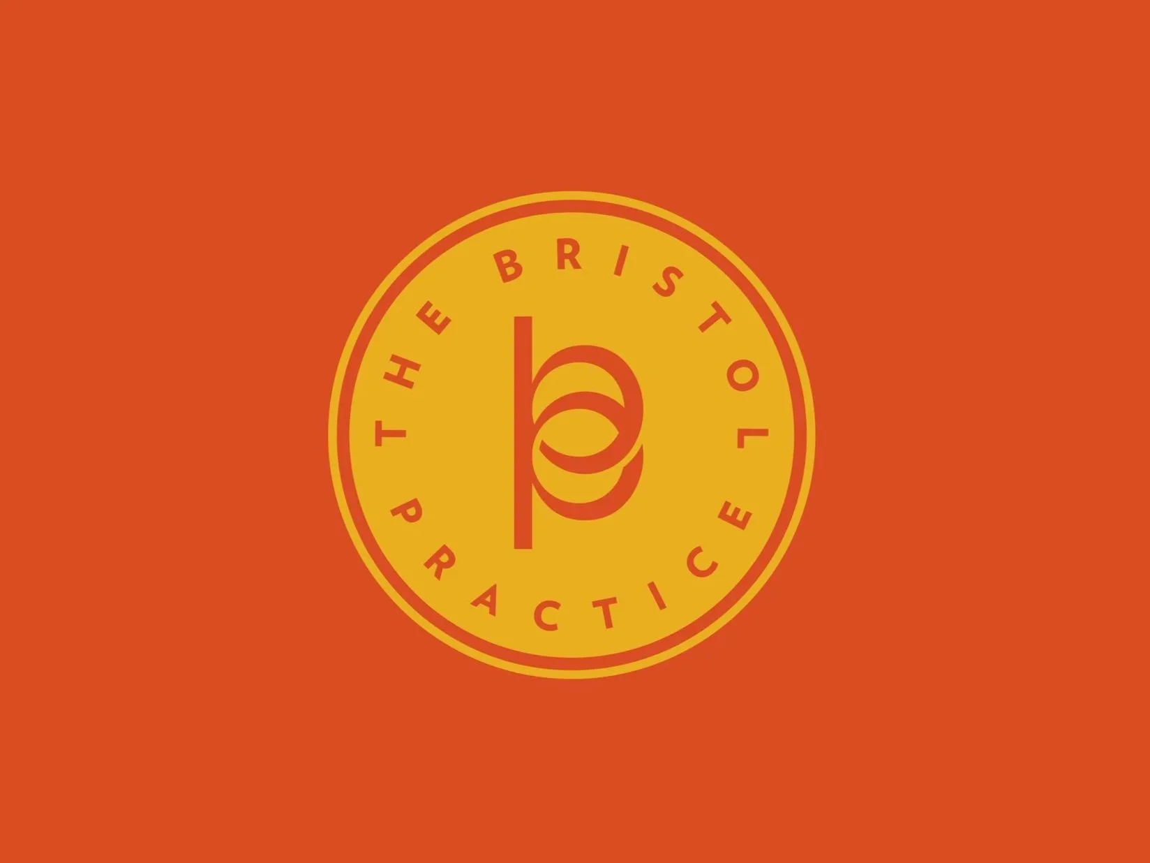
At the heart of The Bristol Practice identity is an interlinked B and P monogram, representing collaboration and continuity. To reinforce trust - a cornerstone of healthcare branding - we housed the logo within a circular roundel, echoing the feel of a stamp, seal or kite mark. This mark gave the brand an official, reassuring quality while still feeling modern. Paired with lifestyle imagery of outdoor pursuits and exploration, the identity balanced authority with aspiration, setting the brand apart from the sterile aesthetics of traditional healthcare.
-
Copywriting sets the tone of voice, how a brand sounds and speaks to its audience.
For The Bristol Practice, we developed a style that was active, engaging, and optimistic. The language centred on discovery and progress, “finding your path,” “a shared journey,” “pro-active not reactive”, echoing the idea that health is something lived every day. Warm, transparent copy helped build trust while inspiring patients to see their wellbeing as part of a bigger journey.
-
Marketing materials are where strategy, design and copy come together to connect with people.
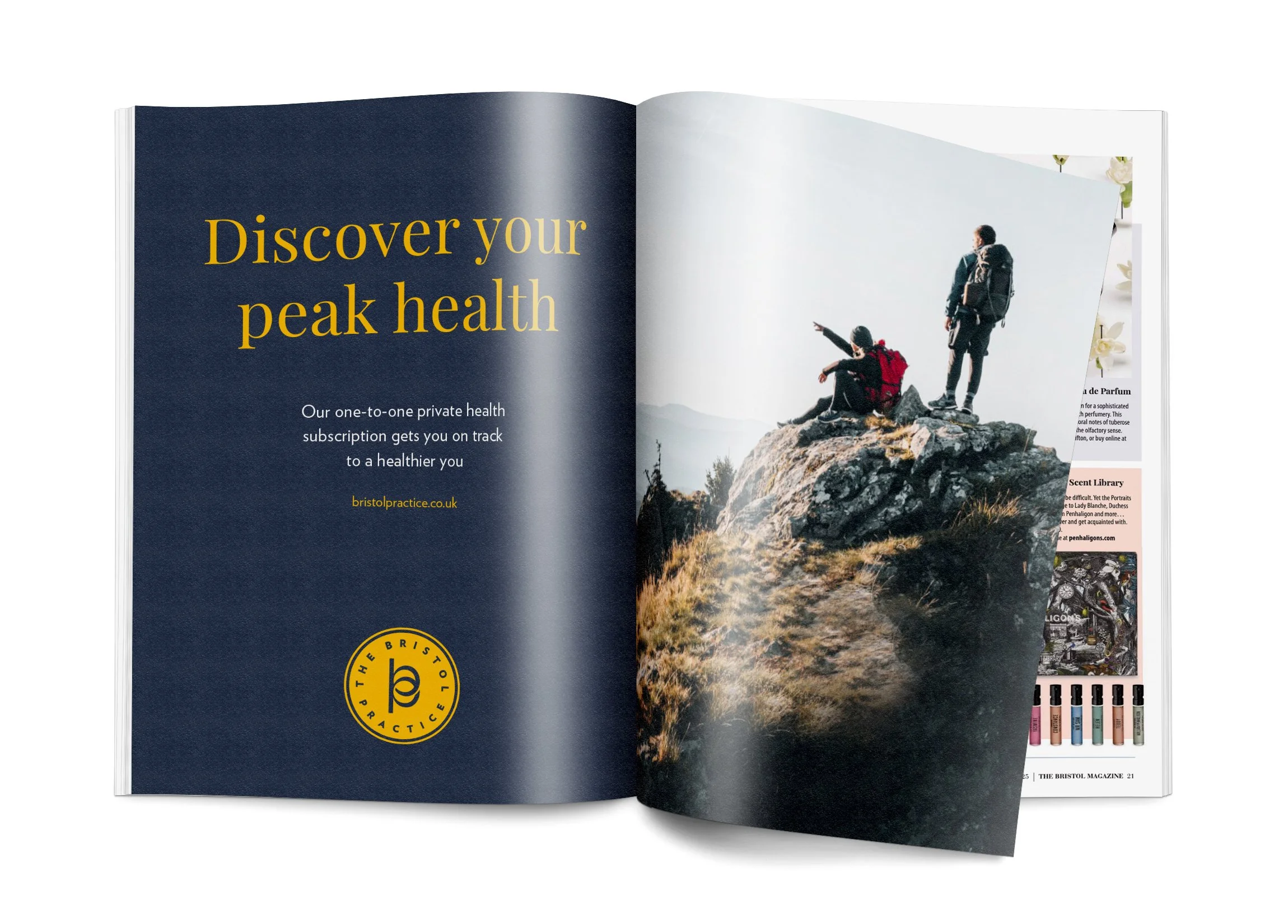
We created a set of adverts that paired aspirational lifestyle imagery with health-focused wordplay. Headlines such as “Discover your peak health” were matched with climbers reaching a summit, reinforcing the journey-not-destination mindset. These materials positioned The Bristol Practice as both aspirational and accessible; healthcare that fits modern, active Bristol lives.


Copywriting plays a vital role in any brand - we focused on reflecting a proactive approach to health, not just reacting to problems, but encouraging people to see wellbeing as a journey. Using a dynamic tone and language tied to discovery and adventure, the words worked hand-in-hand with the lifestyle imagery to tell a story of possibility, energy and forward motion.

We curated a set of royalty-free images as if we were art-directing a single photoshoot. The result feels cohesive and intentional, without the cost of commissioning photography.
Henry Hardy, The Bristol Practice
“Working with Tom was a delight from start to finish. He was really helpful in guiding us through the process of creating a brand. His strategic wizardry took our often vague ideas and turned them into something tangible and brilliant.”