Bravas Tapas Bar
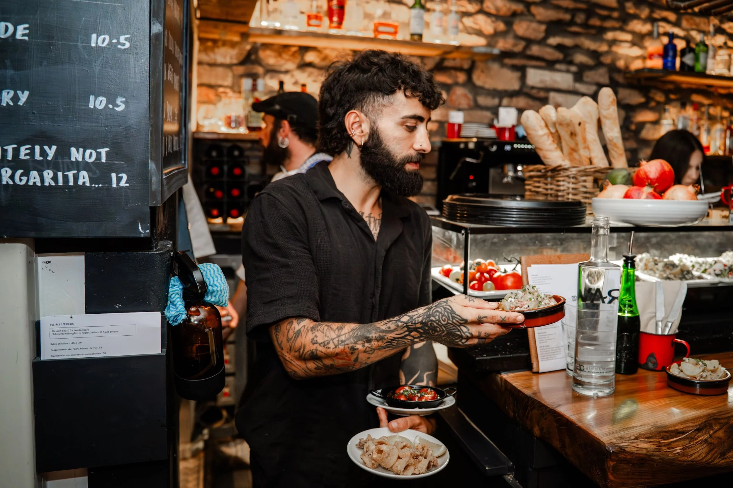
Bravas is a neighbourhood gem on Cotham Hill, serving up Spanish small plates that are as warm and inviting as the bar itself. Their food is rooted in tradition but never stuck in it, seasonal tapas, thoughtful pairings, and a convivial space that buzzes with energy and hospitality.
Over the years, they’ve become one of Bristol’s most loved restaurants, known for both their authenticity and their approachable style.
We partnered with Bravas 13 years ago, our role was to translate the owners vision and spirit into a visual identity that felt true to its roots. The design took cues from the vernacular of Spanish tiled signage and the flowing, hand-rendered lettering often found on bar and café fronts across Spain. From there we developed a brand world that stretched across menus, digital, window displays and art direction for photography; a look and feel that gave Bravas a strong, authentic presence without ever feeling over-designed.

Bristol’s Spanish institution
The challenge
When Bravas opened 13 years ago, it was one of Bristol’s first tapas bars. The identity needed to feel authentic to Spain’s neighbourhood bars while fitting naturally into Cotham, genuine and unfussy, not pastiche or pretence.
The approach
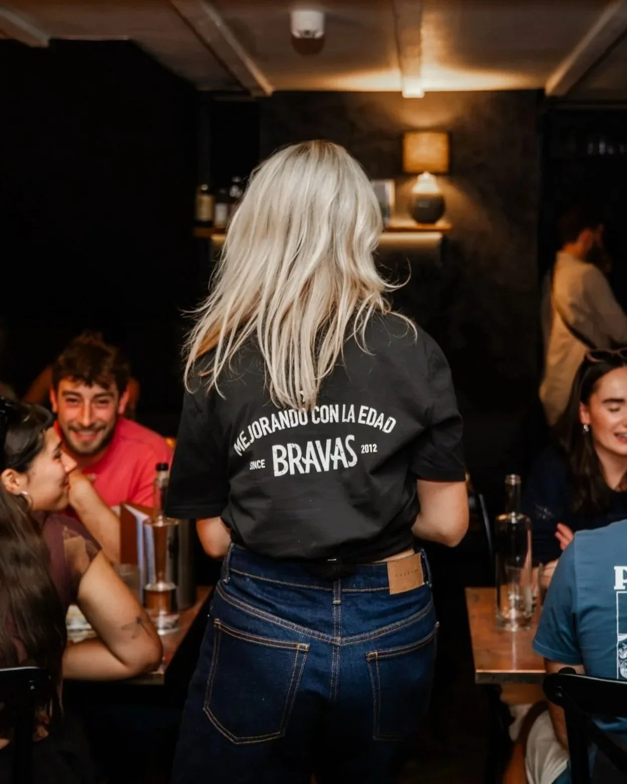
We drew from Spanish vernacular design, especially hand-painted tiles. The flick of the “A” gave character, while the rest of the logo was stripped back for versatility; easy to stamp on menus, embroider into aprons or chalk onto a board. Confident in its simplicity, just like the food.
The outcome
Over a decade later, Bravas is a Bristol institution. The logo still feels fresh, framing an atmosphere that’s convivial, down-to-earth and full of character.
Looking to add more flavour to your brand?

A nod to the handwritten road signs in Spain, the kick of the ‘A’ in Bravas was the only embellishment afforded the un-fussy logomark.


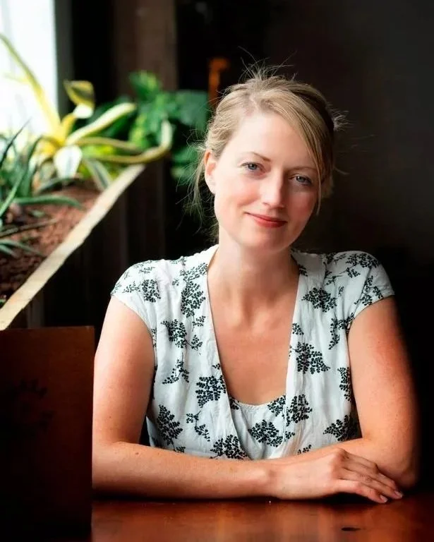
Imogen Waite, Owner Bravas
“Bravas started life as a supper club, so when it came to opening the doors we wanted the same spirit to shine through. Tom clicked with our vision straight away and added his own spark, from how Bravas should feel right down to the small details (he even designed the wine glass rack).”